The Philosophical Gourmet Report (PGR) is a data resource for prospective graduate students in philosophy to help students choose which graduate programs to pursue. Based on survey data collected from philosophers, the report offers scores and rankings of philosophy PhD-granting Institutions throughout the English-speaking world. To help improve the PGR’s accessibility and impact, I’ve utilized some data analytics methods to create visualizations, analyses, and a relational database for all publicly available PGR data. On this page, I have a collection of visualization dashboards that display the PGR data from its 2021 iteration pertaining mostly to Institutions’ specialized rankings. To view my other findings and analyses, see the main project page for my Data Analysis of the Philosophical Gourmet Report (PGR).
I hope that prospective graduate students find this analysis useful, and that philosophers, or anyone, find the visualizations of interest. The visualizations should be a useful tool in helping students to compare graduate Institutions on both the quantity and quality of the various Specializations they offer, as well as an institutions’ specialized scores versus its overall scores.
Table of Contents:
- About the Visualizations
- Links to the Dashboards
- Distribution and Quality of Specializations across Institutions
- Overall Distribution of Specializations
- Specializations by Area: Quality and Quantity
- Specialized vs Overall Quality by Area
About the visualizations
The visualizations were generated using Excel spreadsheets for data cleaning and organization and Tableau for the visualizations. They are broken down into three major groups: The first group concerns the summary distribution of all specializations and areas across top philosophy Institutions. The purpose is to give readers a visual sense of how many Specializations are found at an institution and how strong they are. The second group concerns the summary amount and distribution of all Specialty Programs, which are defined as incidences where an Institution is recommended for a Specialization. The purpose of these visualizations is to showcase the variety of possible areas of specialization graduate students have access to at top PhD granting institutions throughout the English-speaking philosophical world. The third group concerns the relationship between Institutions’ Overall scores and their Specialization scores within a certain area of philosophy. This enables students to compare an Institutions’ overall strength with its strength in a particular area of philosophy.
All of the visualizations can be found on my Tableau profile. The full dataset I used was taken directly from the PGR website and can be found on Kaggle, where I’ve made my cleaned version of the dataset available for public use. I have pasted images of the dashboards below, each of which links to its interactive version on Tableau.
This is an ongoing project and the visualizations are subject to updating and tweaking over time. New methods of offering visualization and analysis may also arise, so stay tuned! In particular, I am interested in tracking changes over time from previous iterations of the PGR, but more on that in the future.
(Note: View the interactive dashboards on desktop for the best experience!)
Links to the Dashboards
Overall Visualizations
- Quality and Quantity of Specializations at top Philosophy PhD Granting Institutions in 2021
- Total Distribution of Philosophy Specializations Across Institutions
Distribution of Philosophy Specializations by Area:
- Metaphysics and Epistemology
- Philosophy of Science and Mathematics
- History of Philosophy
- Value Theory
Institutions’ Overall vs. Area Quality
- Metaphysics and Epistemology
- Philosophy of Science and Mathematics
- History of Philosophy
- Value Theory
Distribution of Specializations across Institutions
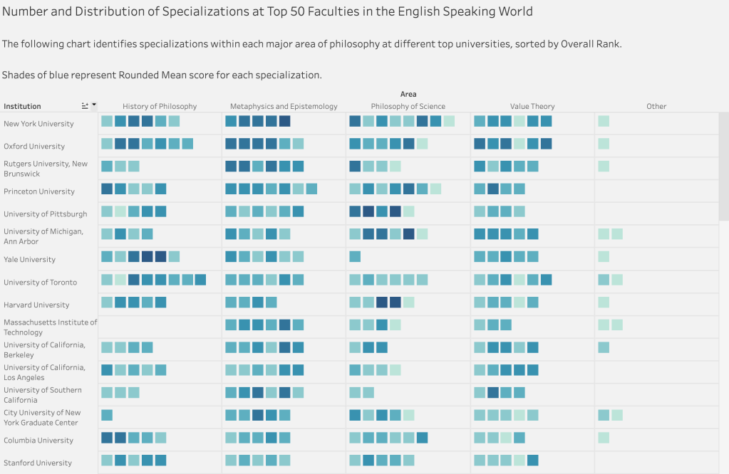
These visualizations show the distribution of Specializations within four major Areas of philosophy over the top 50 Institutions in the English-speaking world. Click here to see the full dashboard on Tableau. In the first chart, the institutions are sorted by Overall Rank. A preview is below. Note that the Overall Rank is determined by an independent, general rating of the department, and is not tied (at least not directly) to scores for specializations.
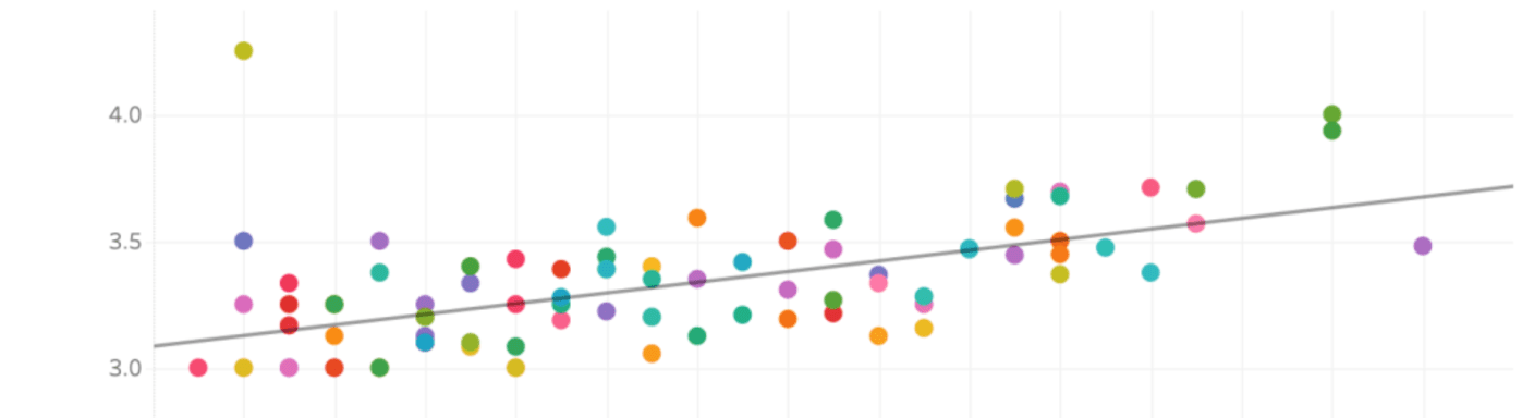
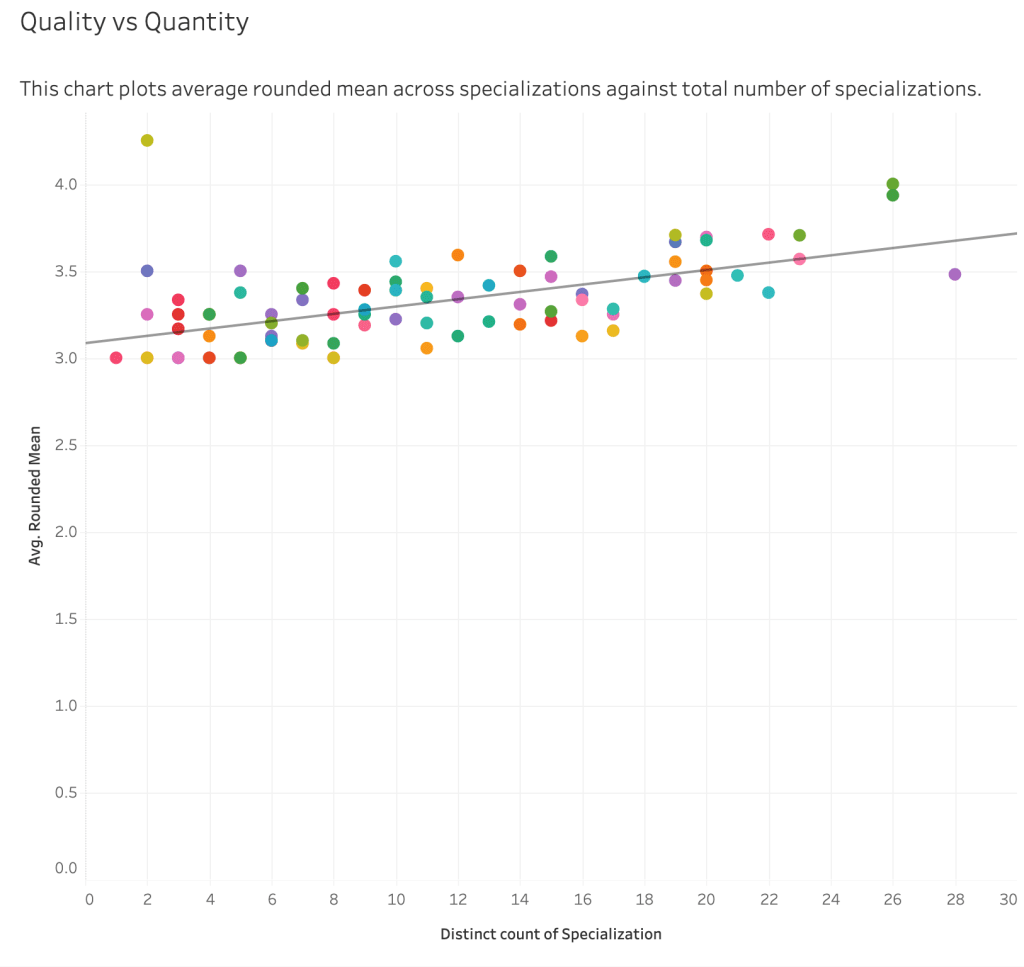
Additionally, I generated a scatter plot which maps the amount of specializations against a school’s average Rounded Mean score of all its specializations. The chart shows a positive correlation between the number of Specializations an Institution offers across all areas of philosophy and the average Rounded Mean score of those Specializations.
Findings:
All but one of the top 10 Institutions have specializations within each major area, with the Massachusetts Institute of Technology lacking any specializations within the History of Philosophy. (The History of Philosophy is otherwise fairly evenly represented among top 10 programs.)
Yale University (Rank 6) only has one potential specialization within the Philosophy of Science.
Only 2 out the top 10 institutions lack any Specializations in the “Other” category, which includes Feminist Philosophy, Philosophy of Race, Indian Philosophy, and Chinese Philosophy.
What I found most interesting is that the quality and quantity of top philosophy programs are positively correlated, meaning that the more potential specialties a program has, the better it is at each specialty.
Overall Distributions of Specializations
I then wanted to look at the distribution of specializations across Institutions in order to determine the total number of opportunities within top philosophy programs to study a particular specialization. To do so, I decided to count the occurrence of a Specializations at an Institution and give it the label of “Specialty Program.” This is a somewhat misleading name, as Specializations are sometimes awarded on the basis of the quality of a very limited number of faculty, (e.g., just one). However, the data point still enables us to get a sense of how many options for Institutions a student has access to when pursuing a Specialization.
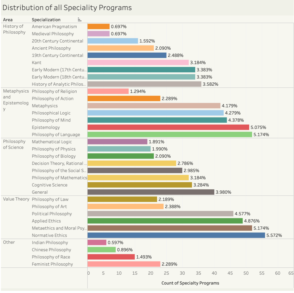
Here is a sample distribution breakdown of all Specialty Programs grouped by Area. The number on the right represents the % of all total Specialty Programs.
Findings
The most common Specialty Programs are in Normative Ethics, Metaethics and Moral Psychology, Philosophy of Language, and Epistemology.
The least common Specialty Programs are in American Pragmatism, Medieval Philosophy, Chinese Philosophy, and Indian Philosophy. This is not terribly surprising, but it is somewhat disappointing. (Of course, I speak as a scholar of Chinese philosophy so am naturally disappointed to see it so underrepresented!)
I guess the question is: Why aren’t top Institutions hiring experts in these areas? The answer probably depends on the particular Specialization. The PGR notes, for instance, that graduate programs with specialists an Indian philosophy might also overlap with Religious Studies or Asian Studies programs. I suspect that the same is true for Chinese philosophy, where the fields of Sinology and (East)/Asian studies overlap considerably. Nevertheless, I hope that these two areas can increase their share of Specialty Programs to be at least 1% in the future.
For Medieval Philosophy and American Pragmatism, I’m not quite sure, though I am more surprised by the former’s scarcity than the latter’s, which strikes me as far more narrow.
Specializations by Area: Quantity and Quality
Each major area of philosophy (according to the PGR) has its own accompanying dashboard showcasing the quantity and quality of Specializations at each Institution, which you can visit at the links below. I hope that prospective students find the breakdowns useful to help them target institutions that cater to their philosophical interests. Each dashboard includes a chart showing the number of Specializations within an Area at each Institution, two more charts showcasing the Rounded Mean Scores and Grouping of Institutions within a Specialty, and a breakdown of the Rounded Mean distribution and number of Specializations across the Area.
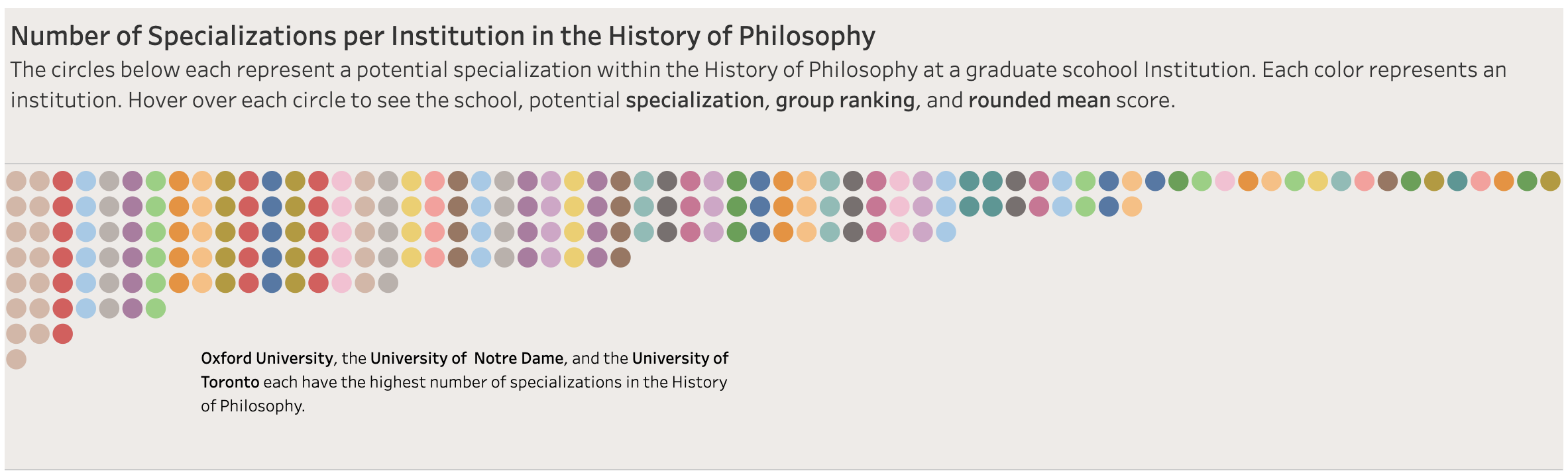
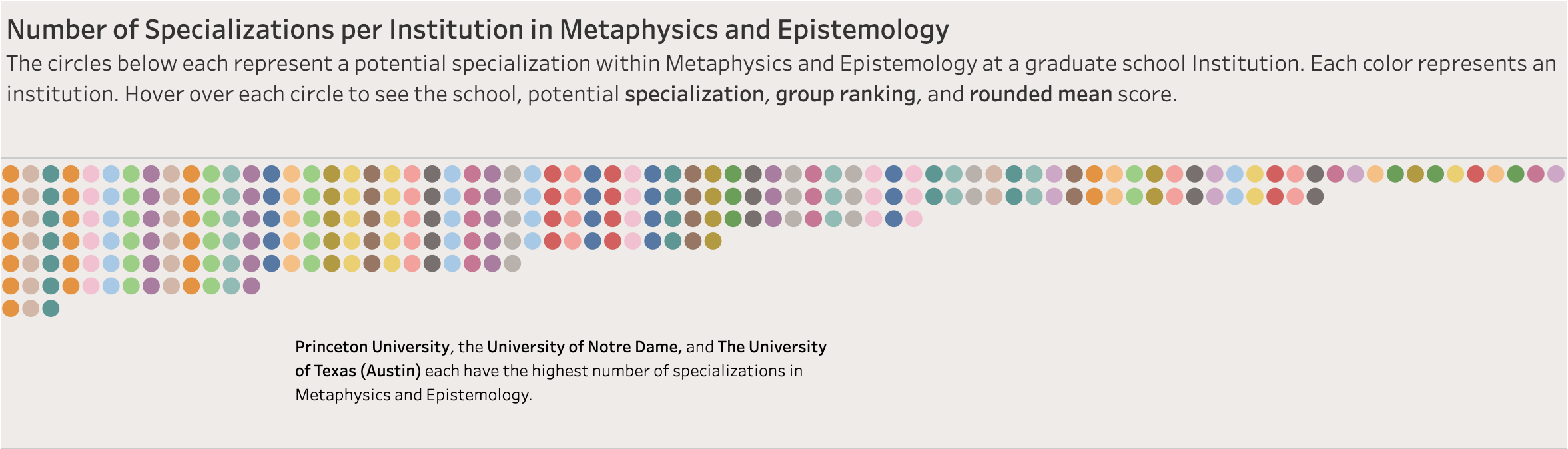
Stills from the dashboards outlining the number of Specializations at each Institution in a particular Area can be found in the slideshow below, with the color denoting the institution and the circles denoting each specialization. Of course, the fully interactive dashboard makes this information explicit when you hover over each circle. (Note: I did not make a dashboard or visualization for the “Other” category owing a paucity of data and its miscellaneous nature.)


Interactive dashboards for each Area:
Specialized vs. Overall Quality by Area
In addition to the visualizations on the distribution of specialties, I have also created ones that compare an Institution’s average Rounded Mean scores across an Area with its Overall Mean score. These visualizations should give students a sense of which programs not only are strongest in their respective Areas, but also how those specializations compare to the Institution’s Overall Mean score based on the PGR survey feedback.
The new visualizations relate two main data points: 1) the overall Mean score determined by the PGR survey for each Institution, and 2) the Area Mean score, which I calculated by taking the average of the Rounded Mean scores throughout the scored specializations at an Institution. (This is because some institutions are recommended for a specialization, but were not rated.) I created two visualizations to illustrate this relationship: a scatter plot, and two adjacent bar charts. The purpose is to give readers a sense of how an Institution’s overall score compares with the scores of its Specializations within an Area.
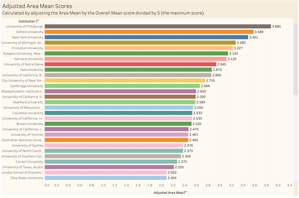
I then calculated a third value I call the Adjusted Area Mean score, which multiplies the Area Mean score by the overall Mean score divided by 5, the maximum score. This enables us to tie Area Mean scores to Overall mean scores to get a sense of how strong an Institution is within an area in light of its overall score.
Here is a still from the scatter plot for the Philosophy of Science and Mathematics:
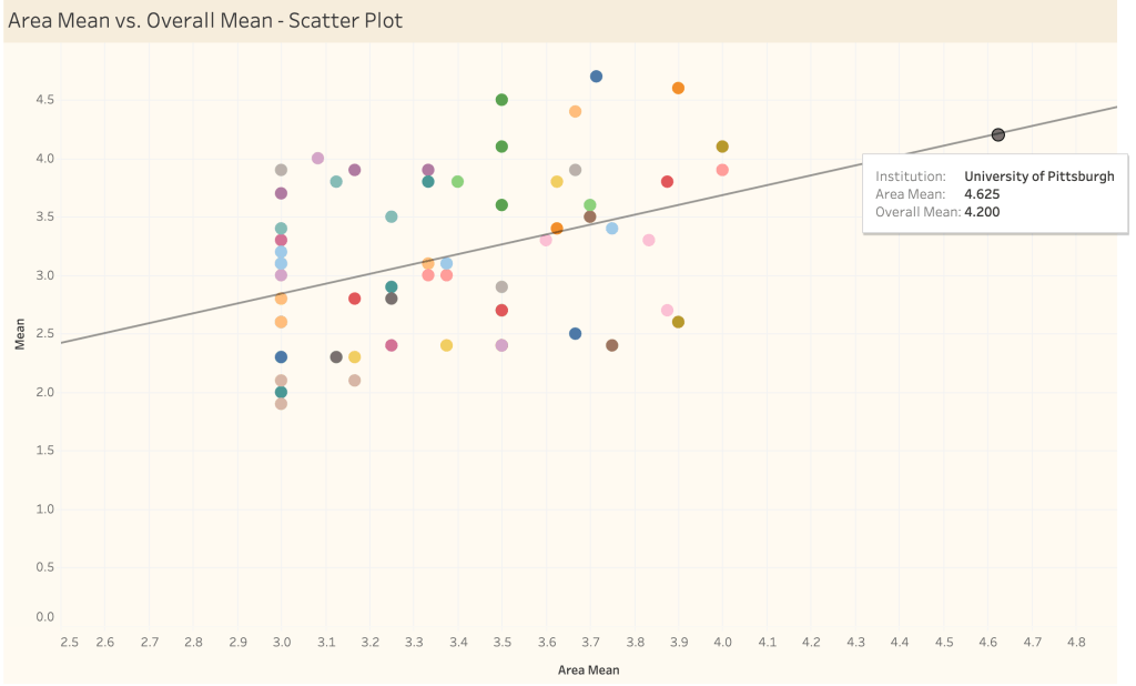
With this visualization, the relationship between an Institution’s strength in a particular area versus its overall strength is immediately clear. For example, the University of Pittsburgh stands quite prominently ahead of other departments in terms of its Area Mean in the philosophy of science, but is also quite highly rated according to its Overall Mean score, making it an excellent choice.
The adjacent bar charts are also conducive to such analyses. In the dashboard, which is linked at the bottom of this post, you can sort each institution by Area Mean or by Overall Mean:
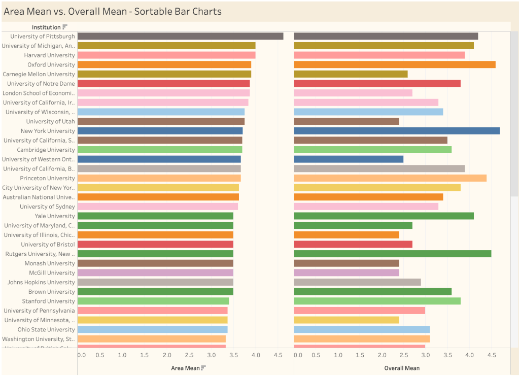
These bar charts make the following sort of analysis quite straightforward: Suppose a student is interested in studying the philosophy of science and is trying to determine which programs have the highest overall quality and variety of specializations within the philosophy of science. Pittsburgh, with its combination of Area expertise and overall quality seems like an excellent choice, having four highly-scored specializations to choose from (General Philosophy of Science, Cognitive Science, Philosophy of Biology, and Philosophy of Physics), as well as a recommendation for Philosophy of the Social Sciences.
But what comes next? Likely, the reasoning will involve weighing the Area Mean scores against the Overall Mean scores in order to identify strong programs within the philosophy of science that also have high overall scores, making both the University of Michigan (Ann Arbor) and Harvard University solid choices–though with a preference for Michigan by a small margin. The difference between Carnegie Mellon and Oxford, however, is a bit more striking: Both have equivalently rated (and the same number of) specializations in the philosophy of science, but Oxford has a much higher overall rating (4.6) than Carnegie Mellon (2.6).
In making these choices, there are at least two ways of proceeding: First is to have a preference for programs with the highest Area scores but acceptable Overall scores (e.g. Carnegie Mellon). Second is to prefer programs that have the highest Overall scores but also have strong Area scores (e.g., Oxford). The Adjusted Area Mean chart below offers scores based on the second option by scaling the Area Mean score with the Overall Mean score.
In the still below, we can see that the University of Pittsburgh leads the way in the Philosophy of Science by this metric, but not quite by as much as it might seem to according to the X axis of the scatter plot. Although Oxford University (Orange) and New York University (Blue) are weaker in the Area of the Philosophy of Science, their Overall Mean scores are high enough put them just behind Pittsburgh, which still appears by these metrics to be the strongest place to study the philosophy of science. Carnegie Mellon, to contrast, is much lower down on the list, with an Adjusted Area Mean Score score of 2.028.
Finally, it’s worth mentioning that these graphics are not supposed to make the decision about which programs to pursue easy by any stretch. There may be perfectly good reasons to pursue a high-scoring Specialization at an Institution with a lower Overall score and vice versa. The goal in presenting the data this way is to make the analysis and comparison process more intuitive.
You can find links to the dashboards below. Feel free to click around!
