
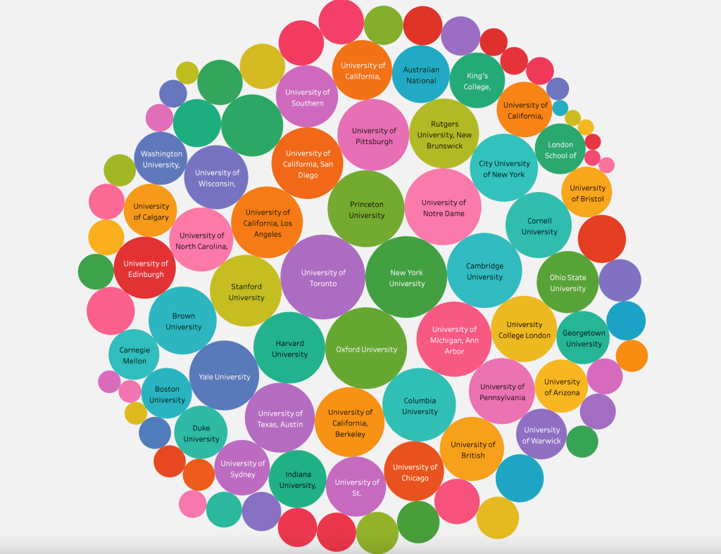
I decided to try my hand at visualizing the PGR’s data about the rankings and specialties of top philosophy programs in the English-speaking world. It was a lot of fun, and hopefully might be useful to somebody. Below is a sample screenshot of the bubble chart showing distributions of potential areas of specialization across the top Institutions. Click the link below for the full writeup!

Leave a comment