
One useful comparison the PGR data allows us to make is between an Institution’s scores within a certain Area of philosophy and its Overall score. However, the data is a bit cumbersome to navigate in table form, and so help improve the raw data’s utility, I’ve added more visualizations for each major Area and a new metric for each Institution. This will enable readers to get a more intuitive sense of how an Institution’s Specializations within an Area stack up against its overall score.
The new visualizations relate two main data points: 1) the overall Mean score determined by the PGR survey for each Institution, and 2) the Area Mean score, which I calculated by taking the average of the Rounded Mean scores throughout the scored specializations at an Institution. (This is because some institutions are recommended for a specialization, but were not rated.) I created two visualizations to illustrate this relationship: a scatter plot, and two adjacent bar charts. The purpose is to give readers a sense of how an Institution’s overall score compares with the scores of its Specializations within an Area.
I then calculated a third value I call the Adjusted Area Mean score, which multiplies the Area Mean score by the overall Mean score divided by 5, the maximum score. This enables us to tie Area Mean scores to Overall mean scores to get a sense of how strong an Institution is within an area in light of its overall score.
Here is a still from the scatter plot for the Philosophy of Science and Mathematics:
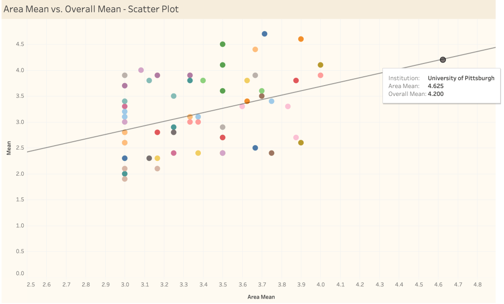
With this visualization, the relationship between an Institution’s strength in a particular area versus its overall strength is immediately clear. For example, the University of Pittsburgh stands quite prominently ahead of other departments in terms of its Area Mean in the philosophy of science, but is also quite highly rated according to its Overall Mean score, making it an excellent choice.
The adjacent bar charts are also conducive to such analyses. In the dashboard, which is linked at the bottom of this post, you can sort each institution by Area Mean or by Overall Mean:
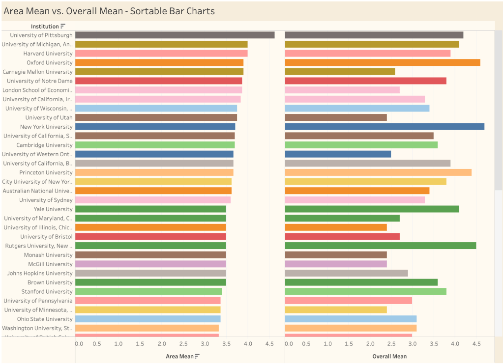
These bar charts make the following sort of analysis quite straightforward: Suppose a student is interested in studying the philosophy of science. Pittsburgh, with its combination of Area expertise and overall quality seems like an excellent choice, having four highly-scored specializations to choose from (General Philosophy of Science, Cognitive Science, Philosophy of Biology, and Philosophy of Physics), as well as a recommendation for Philosophy of the Social Sciences.
But what comes next? Likely, the reasoning will involve weighing the Area Mean scores against the Overall Mean scores in order to identify strong programs within the philosophy of science that also have high overall scores, making both the University of Michigan (Ann Arbor) and Harvard University solid choices–though with a preference for Michigan by a small margin. The difference between Carnegie Mellon and Oxford, however, is a bit more striking: Both have equivalently rated (and the same number of) specializations in the philosophy of science, but Oxford has a much higher overall rating (4.6) than Carnegie Mellon (2.6).
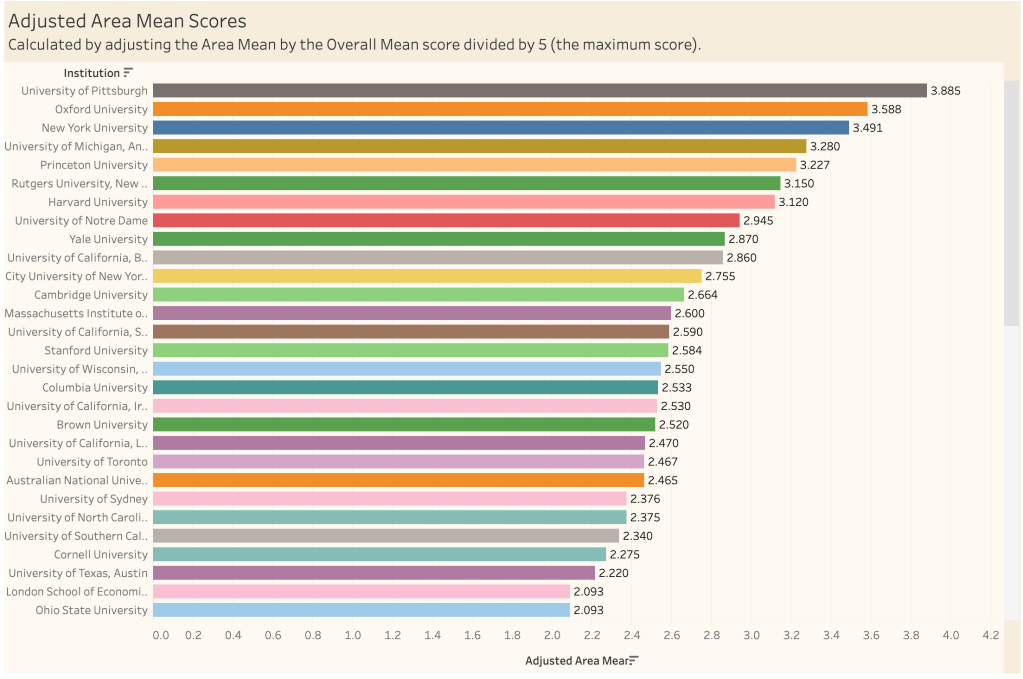
In making these choices, there are at least two ways of proceeding: First is to have a preference for programs with the highest Area scores but acceptable Overall scores. Second is to prefer programs that have the highest Overall scores but also have strong Area scores. The Adjusted Area Mean chart below offers scores based on the second option by scaling the Area Mean score with the Overall Mean score.
In the still below, we can see that the University of Pittsburgh leads the way in the Philosophy of Science by this metric, but not quite by as much as it might seem to according to the X axis of the scatter plot. Although Oxford University (Orange) and New York University (Blue) are weaker in the Area of the Philosophy of Science, their Overall Mean scores are high enough put them just behind Pittsburgh, which still appears by these metrics to be the strongest place to study the philosophy of science. Carnegie Mellon, to contrast, is much lower down on the list, with an Adjusted Area Mean Score score of 2.028.
Finally, it bears mentioning that these graphics are not supposed to make the decision about which programs to pursue easy by any stretch. There may be perfectly good reasons to pursue a high-scoring Specialization at an Institution with a lower Overall score and vice versa. The goal in presenting the data this way is to make the analysis and comparison process more intuitive.
You can find links to the dashboards below and on the main Visualizing the PGR page at the bottom. Feel free to click around!

Leave a comment